Foundations Typography
Typography serves to create hierarchy, demonstrate useful organization, and promote readability. Consistent typography creates a cohesive user experience across multiple digital products, enabling the brand to develop its users' trust.
General
The State of Michigan uses Montserrat for all typographic needs. It can be downloaded from Google Fonts for use in apps, mockups, and prototypes. In code, font size is measured in rem units, which rely on the browser to size text proportionally and allow users to scale text to fit their needs. By default, 1rem is equal to 16px. Regular, medium, and bold weight can be used throughout the text, but much of it is case specific. Learn more about text helper classes here.
Styles
We use Montserrat for all text and set letter spacing at 0.3 pixels. We use regular, medium, and bold weight with our text. Our default body copy text, used for all paragraphs, uses .text-type-5. CSS utilities for styling typography can be found here.
Text color
Color is used with text to help inform users, draw their attention to important updates, and identify which portions of text are interactive. Color, when used correctly, also helps establish the state's brand with our audience. Depending on the context, certain texts will use certain colors, such as the ones below.
Teal
As the state's primary color, teal is used for clickable or interactive text. For example, links are teal when inactive and turn dark teal when hovered over. Teal can also be used as an accent color as well, like in the light teal on navy background example below. You'll use light teal when using the navy background for accessibility purposes.

Teal on white background

Light teal on navy background
Header text
Because a header identifies the subject of the content that follows, it needs a color that can catch users' eyes. This is why we use header text, which is our darkest gray. Its bold text adds weight to headlines, subheaders, labels, and more.
Body
Body text utilizes our body copy gray. Serving as a default text color, it's not as dark as heading gray, so it doesn't take attention away from other elements, but it is dark enough for clarity and ease of use, making it perfect for using on large sections of text.
Caption
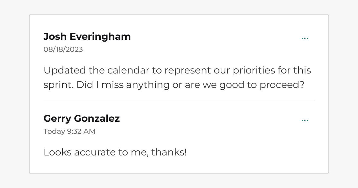
Text that's not as important as more relevant content—such as captions, inline text, and form input helper text—uses caption gray. As our lightest acceptable color for non-disabled text, it helps provide additional information without taking attention away from more important content. Make sure that text that uses this color is 4.5:1 compliant on any background it's used on.

Caption gray inline text
For more on how the Digital Guidelines uses colors, read the Foundations page on colors.
Accessibility
We meet WCAG (Web Content Accessibility Guidelines) 2.1 standards to ensure that content is accessible by everyone, regardless of disability or user device. To meet these standards, text and interactive elements should have a color contrast ratio of at least 4.5:1, and large-scale text should have a color contrast ratio of 3:1. This ensures that viewers who cannot see the full color spectrum are able to read the text.
To ensure a proper color contrast ratio, you can utilize webAIMS' Color Contrast Checker. Find more accessibility guidelines for text here.
Do you have an idea, or want to help us improve this page? Reach out to us via email.
DTMB-DG-Support@michigan.govNeed help? Visit our Support page to learn how to get assistance, troubleshoot issues, and connect with the team.