Component Button
Buttons perform an action when users click on them. Their design and text should make it easy for users to know what they do, and users should be able to use them with little effort.
Example
Props
| Attr | Type | Default | Docs |
|---|---|---|---|
button-aria-label | string | '' | This property is used to set a specific label for screen reader users. This is helpful when using an icon only button. |
button-type | "clear" | "default" | "outline" | 'default' | This property determines the button style |
color | "danger" | "gray" | "nav" | "primary" | "secondary" | "white" | 'gray' | This property determines the color of the button. |
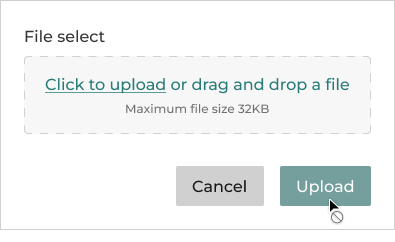
disabled | boolean | This boolean property indicates that the user cannot interact with the button. Specifies that a button should be disabled. | |
icon | string | This property determines which icon to be placed. It should be used in conjunction with iconPosition. | |
icon-position | "left" | "none" | "only" | "right" | 'none' | This property determines which side of the button the icon should appear |
loading | boolean | false | This boolean is used to toggle the loading mode. |
loading-message | string | This property is used to read a message to screen reader users while the button is loading. | |
size | "block" | "lg" | "md" | "sm" | 'md' | This property determines the size of the button. |
type | "button" | "reset" | "submit" | 'button' | The type of the button. |
Events
| Event | Detail | Docs |
|---|---|---|
somBlur | void | This event is emitted when the button loses focus. |
somFocus | void | This event is emitted when the button has focus. |
Anatomy
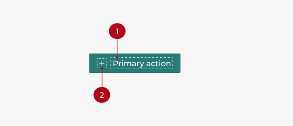
- Button label
- Icon
Types
The three types of buttons represent different levels of hierarchy to prioritize actions.
- Solid: Solid, teal buttons are used for high-emphasis primary actions. A page should have only one primary action.
- Outline: Secondary actions
- Transparent: Low-emphasis actions
Emphasis
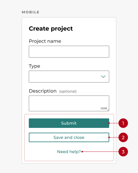
On mobile, actions are stacked vertically and full width, with the primary button on top, the secondary button below it, and the tertiary button below that.
- Primary action
- Secondary action
- Tertiary action
Colors
- Teal is the state’s primary brand color. It’s used for primary action buttons and important actions that users need to take.
- Use navy to filter choices, such as in a data table.
- Use error red for destructive actions.
- Use gray for buttons signifying cancel actions.
- Use white buttons on dark backgrounds so users can see them clearly.
Sizes
There are three sizes for buttons: medium, small, and large.
- Medium buttons are our default size. They fit most of our components, such as form elements.
- Small buttons are used to save space and for less important or nested actions.
- Large buttons attract the user’s attention, so they’re used sparingly for important calls to action.
- When placed horizontally, buttons of different sizes shouldn’t be next to each other.
Behavior
States

Button states communicate the button’s status to the user.
- Default: The standard state of a button.
- Hover: When the cursor moves over a button without clicking it.
- Active: When the button is pressed.
- Focus: When the button receives focus from keyboard interaction.
- Disabled: This represents an unavailable action. Users shouldn’t be confused as to why a button is disabled. If the user is likely to be confused, keep the button enabled and trigger a detailed error when it’s clicked.
Keyboard interactions
Buttons can be focused on with the Tab key and can be interacted with by pressing Spacebar or Enter.
Modifiers
Labels
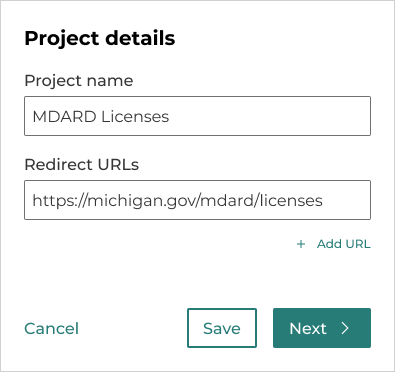
Write button labels that indicate what will happen when interacting with the button. Make sure the label text is concise and clear. Use sentence case.
Keep button labels concise. When possible, use short titles to avoid wrapping.
Button labels should follow the verb + noun formula, except for common actions like Save, Cancel, or Delete.
Buttons with icons
- Icons can be used with buttons when the icon lends more context to the button’s label.
- Icons need to match the button’s label. If the button reads Save, don’t pair it with the trashcan icon.
- Icons by default are to the left of the button’s label, or let them stand alone. If the icons are directional, they can be placed to the right of the button’s label.
- Icons shouldn’t stack vertically with the label.
Icon only
Icon-only buttons can be used without text when the icon’s meaning is obvious to users. They can also be used to save space, although this isn’t required.
Layout
Button width
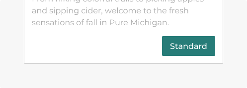
A standard button with its width restrained by its content.
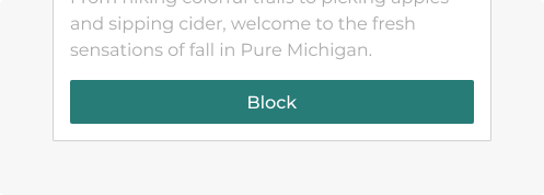
A block button filling its container.
- Text should not stack or wrap.
- A standard button’s width is determined by its label and/or icon.
- A block button fills its container.
- Block buttons should be contained by a card or a mobile device and shouldn’t be wider than 400 pixels.
Positioning
- Medium and large buttons should have
1rembetween each other. - Small buttons should have
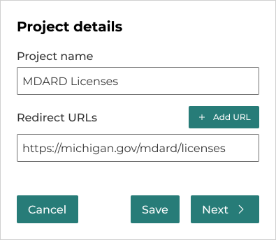
.75rembetween them. - The button’s placement might vary depending on the platform. The button with more emphasis should be located on the far right. For more information on laying out buttons, see Patterns section.
- Avoid stacking buttons on top of one another if they can be placed next to each other, except when designing for mobile devices.
- On mobile devices, arrange buttons from top to bottom according to importance.
Do you have an idea, or want to help us improve this page? Reach out to us via email.
DTMB-DG-Support@michigan.govNeed help? Visit our Support page to learn how to get assistance, troubleshoot issues, and connect with the team.

