Component Toast Group
A toast group is the required container for toast components. You must place an empty toast group on the page to ensure screenreaders can detect an aria-live area upon page load, then add individual toasts as needed.
Example
Props
| Attr | Type | Default | Docs |
|---|---|---|---|
position | "center" | "end" | "start" | 'end' | This property sets the position on the screen toast will display. |
Methods
| Name | Returns | Docs |
|---|---|---|
addToast |
| This public method is used to show a toast. |
Events
| Event | Detail | Docs |
|---|---|---|
toastGroupDismissed | void | This event is emitted when a toast is dismissed. |
Anatomy
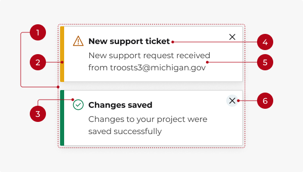
- Toast group container: The outer wrapper that positions the toast on the screen.
- Left border: A semantic color that represents the message type (info, success, danger, warning).
- Icon (optional): A visual cue that indicates the message type (info, success, danger, warning). The icon color matches the left border color.
- Headline (optional): A brief title conveying the gist of the notification. Use sentence case and no punctuation.
- Message text: One or two short sentences that provide feedback, confirm an action, or display a status update. Avoid repeating the headline.
- Close button (optional): A button to dismiss the toast manually before it auto-dismisses.
Types
Info (default)
Use the info type to provide non-critical information.
Success
Use the success type to confirm a successful action or completed task.
Danger
Use the danger type to alert that something has gone wrong.
Warning
Use the warning type to caution about potential issues or unexpected results.
Using with toast group
A toast group is the required container for toast components. You must place an empty toast group on the page to ensure screenreaders can detect an aria-live area upon page load, then add individual toasts as needed.
Colors
Each notification type has an associated color and matching icon to signify different tone and meaning. While icons are optional, color alone is not a sufficient way to convey meaning or distinguish status. To ensure accessibility, always provide an additional indicator, like a descriptive headline or an icon, to communicate information.
Behavior
Placement
Toasts appear in the bottom-right corner of the screen by default. You can change the positioning to bottom-center or bottom-left via the position prop on the toast group component. Multiple toasts will stack vertically, with newer toasts appearing below older ones.
Dismissal
Toasts can be timed or persistent. By default, a toast will disappear automatically after 10 seconds or when the user clicks the close button. You can adjust the auto-dismiss time or turn off auto-dismiss altogether. You can also hide the close button if you don’t want users to manually dismiss.
Interactions
Mouse
Clicking the close button dismisses the toast (if set to dismissible).
Keyboard focus
The Esc key closes the toast. Tab moves focus to the close button (if present). Enter or Space activates the close button (if present).
How to use
Toasts are similar to the alert, dialog, and modal components, but should be reserved for simple feedback, low-priority notifications, and confirmations that do not need to interrupt the user experience.
Key differences
| Toast | Alert | Modal | Dialog | |
|---|---|---|---|---|
| Persistence | Auto-dismisses by default | Non-dismissible by default | Requires user to close manually | Requires user action to dismiss |
| Interruption | Non-intrusive | High visibility, blocks part of the UI | Blocks entire UI | Blocks entire UI |
| Urgency | Low to medium | High | High to critical | High to critical |
| Position | Overlay on bottom-right corner of screen by default, can be moved center or left | Top of screen, spans full width | Centered on screen, above all other content | Centered on screen, above all other content |
| User interaction | Optional | Optional, can be ignored or closed if set to dismissible | Required to acknowledge and close | Required to make decision or input |
| Use case | Notifications, status updates | Site-wide changes, time-sensitive updates | Informational, passive content, onboarding | Form confirmations, decisions |
| Dismissal | Auto or manual | Persistent (non-dismissible) or manual | Manual (close button) | Manual (explicit user action) |
When in doubt:
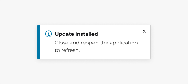
Use a toast for quick, non-intrusive feedback.
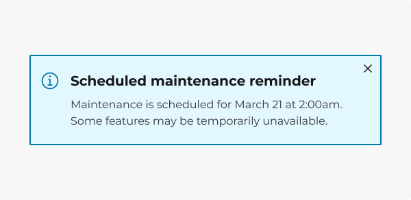
Use an alert banner for important messages that require more attention but don’t block workflow.
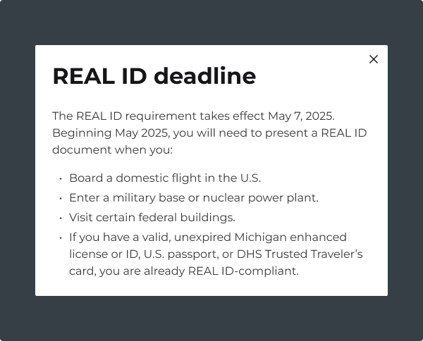
Use a modal when displaying passive content that doesn’t require immediate action.
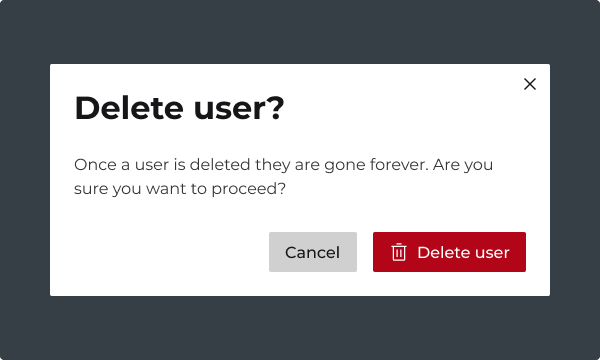
Use a dialog when the user must take action before continuing.
Do you have an idea, or want to help us improve this page? Reach out to us via email.
DTMB-DG-Support@michigan.govNeed help? Visit our Support page to learn how to get assistance, troubleshoot issues, and connect with the team.
