Component Select
This component allows users to make a single choice from a list of options in a dropdown menu.
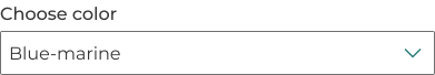
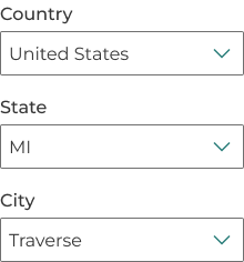
Example
Props
| Attr | Type | Default | Docs |
|---|---|---|---|
disabled | boolean | false | This boolean can be used to disable the select. |
error | string | null | This property can be used to set an error. If a non-empty string is given, it will be used as the error message. |
help | string | '' | This property can be used to set a help text. |
hide-label | boolean | false | This property will visually hide the label. A label is still required to be provided for screenreader support. |
input-aria-label | string | null | This property can be used to set the ARIA label associated with this input (for screen readers). |
input-id | string | generateId('som-input') | This property can be used to specifically set an ID to the input field. If an ID is not provided, it will be dynamically generated. |
label | string | '' | This property can be used to set a label. |
label-class | string | '' | This property is a list of CSS classes that can be used to style the label. |
name | string | '' | This property can be used to set the form field name (used when submitting the form). |
required | boolean | false | This boolean can be used to set the select as required. |
required-ind | "none" | "optional" | "required" | This property is used to override the required indicator. By default, forms elements will show an | |
tooltip | string | null | This property is used to set the tooltip text. |
value | string | This property can be used to set the select value. |
Methods
| Name | Returns | Docs |
|---|---|---|
setFocus | Promise will resolve after focus. | This public method sets focus to the select element. |
Events
| Event | Detail | Docs |
|---|---|---|
somBlur | any | This event is emitted when when the select field loses focus. |
somChange | any | This event is emitted when the select value changes. |
somFocus | any | This event is emitted when when the select field gets focus. |
Slots
| Name | Docs |
|---|---|
label | Label for the select. Alternatively, you can use the label attribute. |
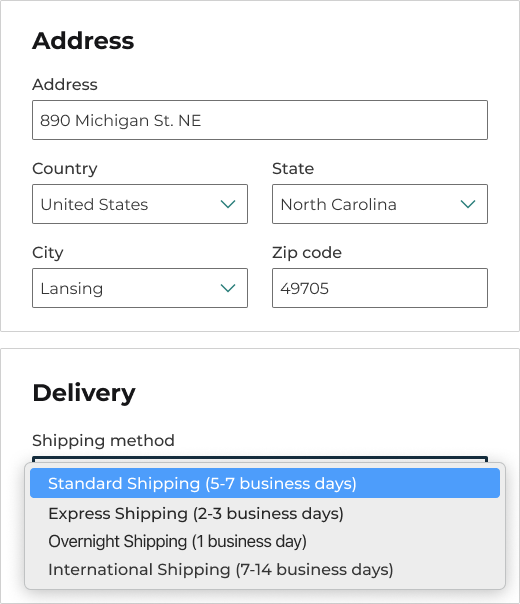
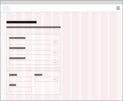
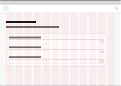
Anatomy
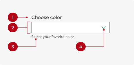
- Label: Text that describes the list of options.
- Field: The select component container.
- Helper text: Provides additional context if needed.
- Chevron icon: Expands the list of options when clicked.

- Option: A single choice from the list.
- List: All available options, displayed when the select component is open.
Labels
Use a label to identify the select’s purpose and describe the available options. Labels should be clear, concise, and use sentence case.
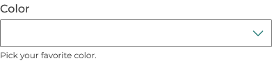
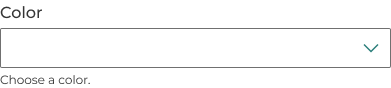
Helper text
Optional helper text can provide more information about a selection. It should add meaningful context to help users make the right choice, not just repeat information from the label.
Required and optional
Selects will show an “(optional)” indicator by default, but can be marked as required or have no indicator at all, depending on the situation.
A good rule of thumb: If most of the form’s fields are required, mark only the optional fields as optional. If most of the form’s fields are optional, mark only the required fields as required.
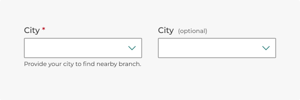
A select can be marked as required (left) or optional (right). The optional indicator is the default.
Tooltips
Add a tooltip by setting the tooltip attribute to the desired text. Use tooltips sparingly and keep text brief and supplementary. Do not include interactive elements. The tooltip appears on hover or keyboard focus.
How to use
Use a select if:
- Users need to choose from a list of multiple options (e.g., selecting a country, product category, or preferred language).
- Space is limited, and displaying all options as radio buttons or checkboxes would be impractical (more than five options).
- Only one option can be selected at a time, such as choosing a shipping method or payment type.
- Options are grouped or categorized (e.g., selecting a subcategory within a category or a state within a country).
- Options may change based on user input or other conditions, allowing for a more interactive experience.
Select or text input?
Any field that prompts a user to provide unique information, such as a phone number, email, or other variable data, will require a text input. Selects are best when there’s a predetermined set of options to choose from, such as states or countries.
Select or radio button?
If an input has fewer than three options, use a radio button group. This ensures all options are immediately visible, which facilitates quick decision-making without extra clicks. If space is a concern or if the input has six or more options, consider using a select instead.

Behavior
States
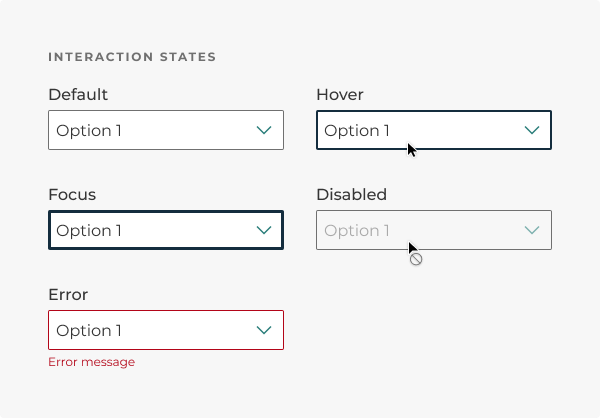
Selects change states based on user interactions.
- Default: The standard state of a select.
- Hover: When the cursor moves over a select field without clicking it.
- Focus: When a user focuses on a select via keyboard interaction.
- Disabled: An unavailable action. Users shouldn’t be confused as to why a select is disabled.
- Error: When input isn't accepted, an error message can display instructions on how to fix it.
- An error state is triggered if the selection is invalid.
- Real-time validation helps streamline the process and keeps data clean as the user fills out a form. Otherwise, validate the select when the user submits the form.
Interactions
Mouse
Clicking within the select field will open or close the list of options. Clicking a single option will select it.
Keyboard focus
Tab brings focus to the select field. Space or Enter will open the select. The up and down arrows highlight the previous or next option. Enter selects the item in the dropdown.
Layout
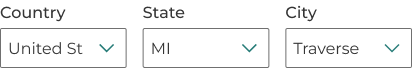
Multiple selects should be arranged vertically in a single column to give users a clear path when filling out a form. Keep all inputs the same width.
Do you have an idea, or want to help us improve this page? Reach out to us via email.
DTMB-DG-Support@michigan.govNeed help? Visit our Support page to learn how to get assistance, troubleshoot issues, and connect with the team.