Component Icon
Icons are symbols used to represent words or actions visually. Used properly, they simplify a user experience by reducing cognitive load. The State of Michigan uses icons from IBM’s Carbon design system. See the iconography foundations page for more information.
Example
Accessibility
All icons ship with the required aria-label attribute, which is used to provide a descriptive label to any assistive technologies.
Props
| Attr | Type | Default | Docs |
|---|---|---|---|
color | string | This property represents the color of the icon. By default, the color will match the current font color. However, you can override this color by passing in the name of SASS variable ( | |
display | string | 'inline-block' | This property represents the CSS display property. In certain circumstances you may need to adjust the display property to properly align the icon. |
name | string | The name of the icon | |
size | string | This property represents the size of the icon. By default, the size will be determined by the current font size. However, you can override this size using pre-built sizes ( |
Anatomy
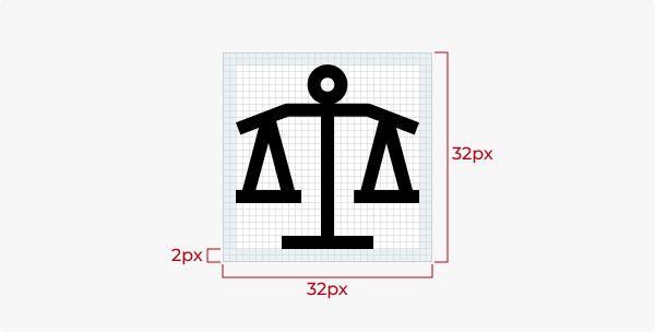
Icons are designed on a 32x32px grid with a 2px stroke and 2px of padding.
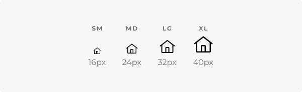
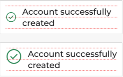
Sizes
Be sure icon sizes are consistent. When used inline with text, icons should match the text’s line height. By default, the size will be determined by the current font size. Icons can be resized by omitting the size prop and adjusting the font size.
Icons come in four sizes:
- Small: 16px
- Medium: 24px
- Large: 32px
- Extra-large: 48px
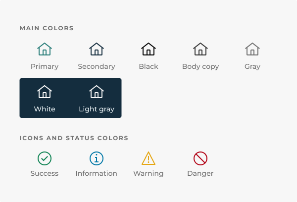
Colors
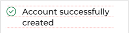
Icons are always a single color with no gradients. By default, the color will match the current font color, but this can be overridden with the color prop. The icon’s color should reflect its role. See the colors foundations page for more on this.
An icon’s color should reflect its role.
Descriptive icons must have a minimum 3:1 color contrast ratio. While decorative icons do not require a 3:1 ratio, it’s still a good guideline to follow to ensure readability.
Styles
The icon library has outline and solid icon types. Outline icons are standard, but the solid versions are provided as well to represent a toggled or selected state.
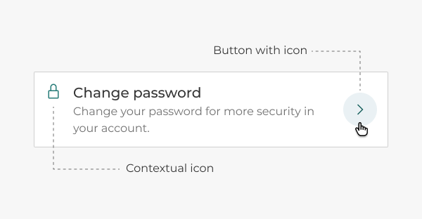
Behavior
Icons are not interactive by default, but can be paired with a button to trigger an action. Buttons with icons have interactive states and modifiers. See the button component page for more info on using icons with buttons.
The contextual icon on the left is static. The icon on the right is inside a button and clickable.
Icon buttons should have a label, except in rare cases where the icon is universally recognizable, such as with home, print, or search.
How to use
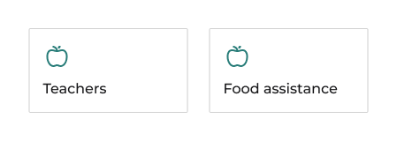
Icons can be descriptive or decorative.
- Descriptive icons convey information or functionality and require alt text to explain their purpose.
- Decorative icons are purely aesthetic and can be marked as such with an empty alt attribute (
alt=""), which will be ignored by screen readers.
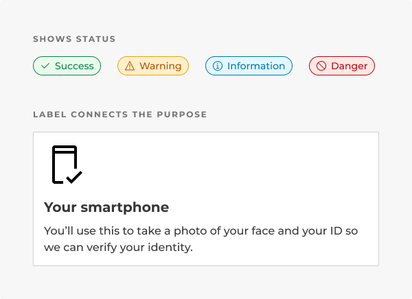
Text can accompany icons to add context. Any accompanying text should be directly related to the icon and the message being conveyed.
Text can accompany icons to add context.
Layout
Some notes on placement:
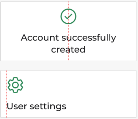
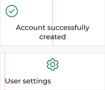
- Icons can be positioned beside or above text.
- Icons placed beside text should be aligned to the top of the text block and match the line height of the text.
- Icons can be placed above content as well.
- If text is left-justified, icons should align to the left.
- If text is centered, icons should align to the center.
Do you have an idea, or want to help us improve this page? Reach out to us via email.
DTMB-DG-Support@michigan.govNeed help? Visit our Support page to learn how to get assistance, troubleshoot issues, and connect with the team.